

Introduction
In the fast-scrolling digital world, visual hierarchy shapes user attention and guides decision-making within seconds. It’s the unspoken order of importance on a page – through size, color, layout, and positioning. Proper hierarchy ensures clarity, boosts readability, and strategically nudges users toward conversion. In this article, you’ll learn foundational principles and advanced techniques to elevate your site’s design and performance.
Why Visual Hierarchy Matters: Enhancing Attention and Trust
Users generally spend only around 5–10 seconds on a landing page before deciding whether to stay. Effective visual hierarchy ensures key messages and CTAs pop first. According to UX firms, well-structured hierarchy can improve conversion by up to 30%. It also helps build trust: users interpret order and clarity as professionalism. If your design lacks logical structure, visitors easily miss your value proposition – even if it’s prominently displayed in the copy.
Elements of Visual Hierarchy: Size, Contrast, Whitespace & Color
Hierarchy isn’t just aesthetic – it’s functional. Larger fonts, high-contrast colors, and ample whitespace draw attention to headlines. Consistent typography and strategic spacing help users scan content efficiently. Bold color choices can highlight CTAs, while grayscale backgrounds and muted tones push secondary info into the background. Whitespace isn’t wasted – it’s strategic breathing room enhancing focus. Limit noise; visual simplicity improves retention and decision clarity.
Scanning Patterns & Layout Strategies: The Z and F Laws
Most users scan webpages in F- or Z-shaped patterns – sometimes an inverted-L on mobile. Eye-tracking studies show placing key elements like your logo, headings, hero image, and CTA along these paths boosts eyeball time by 50%. Aligning content to match scanning flow means users see your messaging in the natural order they perceive it. Optimized layout reduces confusion and accelerates action. Grid-based design and modular sections help guide natural reading paths and boost comprehension.
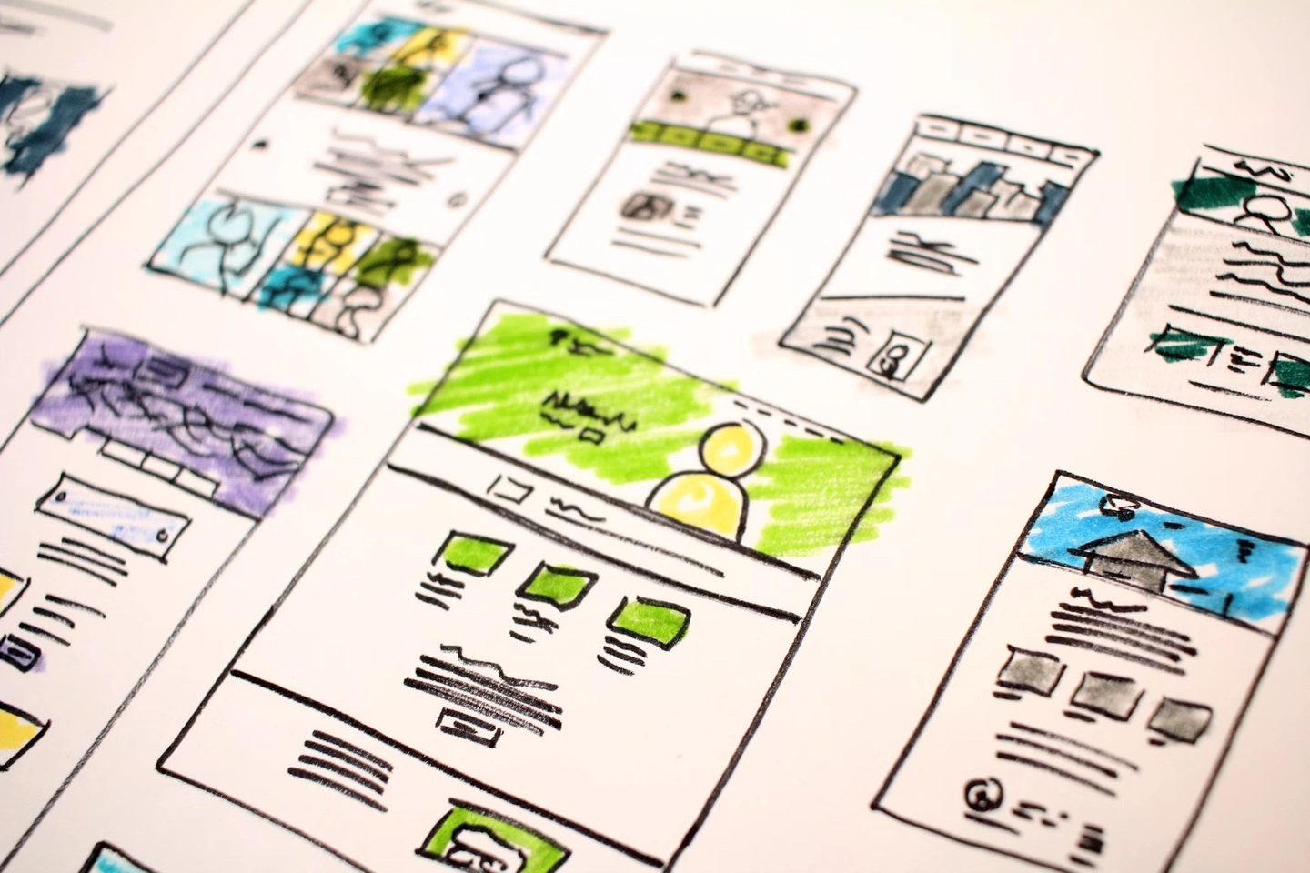
Hierarchical Content Blocks: Structuring Pages for Clarity
Build visual structure by breaking content into distinct blocks – such as hero section, features, testimonials, and CTAs – each with its own emphasis. Each block’s headings should progressively scale in importance: H1 > H2 > H3. For example, the hero section displays a bold header and CTA, while supporting elements like features and testimonials use subtler design. Consistency in block spacing and alignment creates rhythm and flow for readers. Repeated UI patterns reinforce trust and familiarity.
Interactive & Dynamic Hierarchy: Micro-Animations & Hover Effects
Modern hierarchy isn’t static: micro-animations, hover effects, and dynamic reveals add clarity and delight. For example, CTA buttons that gently enlarge on hover draw attention and confirm interactivity. Scroll-triggered elements (like progress bars or fade-ins) keep users engaged as they move through the page. Motion design can guide attention step by step – highlighting priority elements like form fields or feature highlights. These dynamic cues boost guide clarity and conversion intent.
Conclusion
Visual hierarchy is the silent guide helping users perceive value clearly and act confidently. By combining deliberate typographic scale, spacing, scanning-aligned layouts, and subtle animations, you translate design into conversion. Whether you’re building a landing page or a full site, hierarchy should shape every element. When in doubt, check the flow: is the message clear, structured, and persuasive?
Why BlazeDream for UX‑Driven Design
BlazeDream combines visual strategy with user science to craft websites that convert:
- Hierarchy-first wireframes optimized for scanning and flow
- Typography and spacing systems that elevate clarity and brand tone
- Layouts aligned to natural eye patterns, enhanced with modular blocks
- Motion design strategies—subtle yet functional—for visual cues
- Heatmap analysis and optimization loops to continually refine UX
Want Design Clarity That Drives Conversions?
Let us help you architect designs where every visual decision leads to action. Partner with BlazeDream for UX design grounded in science and optimized for growth.
📧 Email us at: reach@blazedream.com
📱 Call us at: +91 9840190624
BlazeDream – designs that speak, persuade, and perform.
FAQs
Q1: How do I test if my hierarchy works?
User testing, heatmaps (e.g., Hotjar, Crazy Egg), and time‑to‑first-click metrics help identify confusion points. If key actions aren’t seen or clicked, adjust priority levels.
Q2: Does visual hierarchy differ between mobile and desktop?
Yes: mobile tends toward vertical scanning. Use larger font scaling, clear sectional breaks, and touch-friendly spacing to guide mobile users intuitively through your content.
Q3: Can color alone create effective hierarchy?
Color can help – but it must pair with size, positioning, and contrast. Overusing bright colors dilutes effectiveness. Strategic combination yields better focus and action.
Q4: Are dynamic effects necessary for hierarchy?
Not essential – but well-designed micro‑animations and hover feedback can elevate user understanding and delight, resulting in higher engagement without slowing performance.
Q5: How do I measure design impact on conversions?
Use A/B testing, heat maps, and funnel tracking. Compare versions with different visual hierarchies and observe form completion, CTA clicks and session durations.